Case Studies
How We Helped Our Clients.
How we Can Help You.
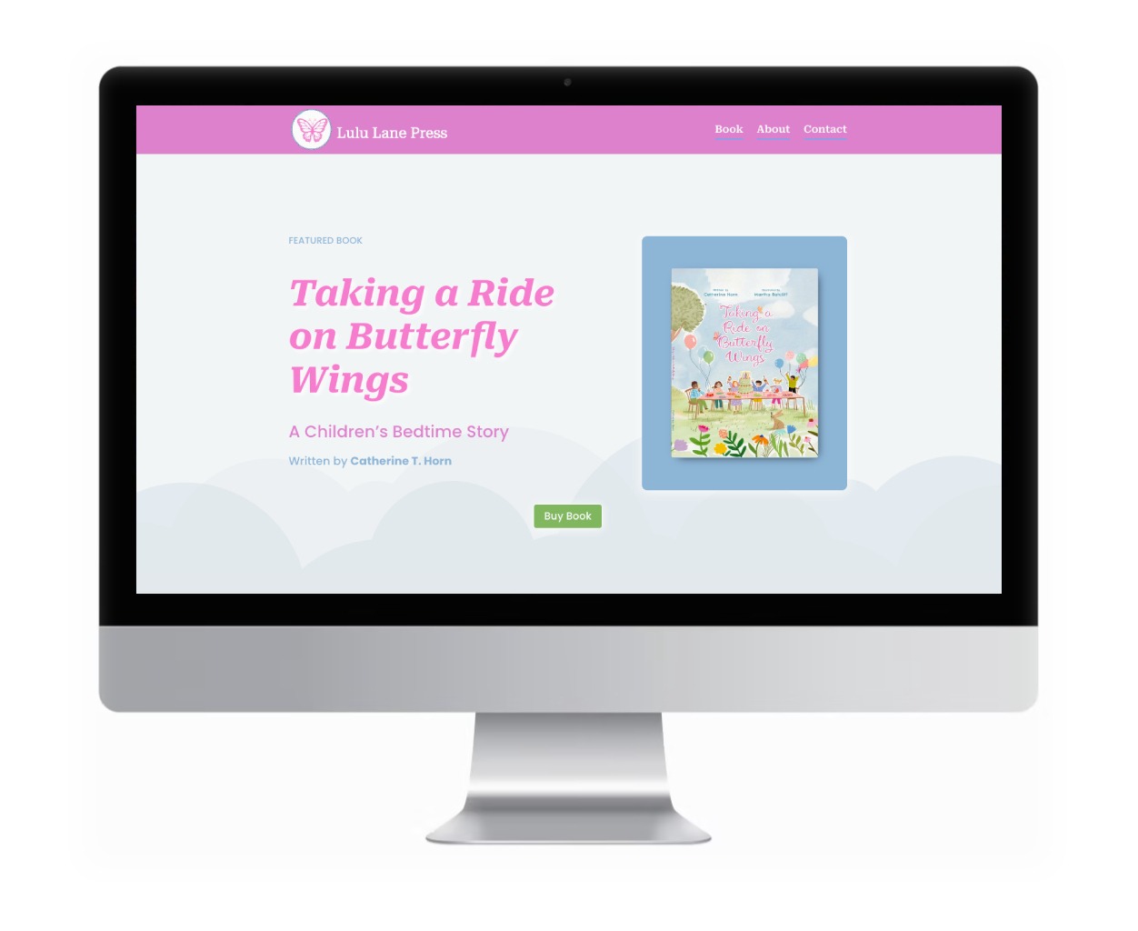
LuluLanePress.com
The Problem:
The author’s previous website was designed before the storybook was released, and it served its purpose well, but it didn’t quite capture the full magic and warmth of her now published children’s book. While her first professionally published work was now available on Amazon, her old website wasn’t ready to showcase it. She needed a fresh, vibrant platform to share her book, attract readers, and allow fans to easily purchase it.
Our Solution:
Bailiwick Marketing designed a colorful, inviting new website that feels as magical as the book itself. We collaborated closely with the author to ensure her vision shined through every page, creating a website that not only showcases the book’s charming illustrations but also makes it simple for readers to find and buy.
To add a personal touch, we took a hand-drawn sketch of a butterfly created by the author’s son—a heartfelt nod to the butterflies in her storybook—and transformed it into a colorful, digital logo for the website. This unique logo beautifully represents the story’s charm while adding an authentic family connection to the site’s design.
The website is clean, bright, and easy to navigate, highlighting the book’s playful aesthetic without overwhelming the reader.
To reach readers wherever they are, we optimized the website to look beautiful and function seamlessly on smartphones and tablets, making it easy to browse and purchase on any device.
We added seamless links to Amazon, allowing fans to purchase with a single click. And with thoughtful SEO enhancements, more readers can now discover this delightful book online.
To keep fans engaged, we included a mailing list signup so visitors can stay updated on the author’s journey, upcoming works, and special events.
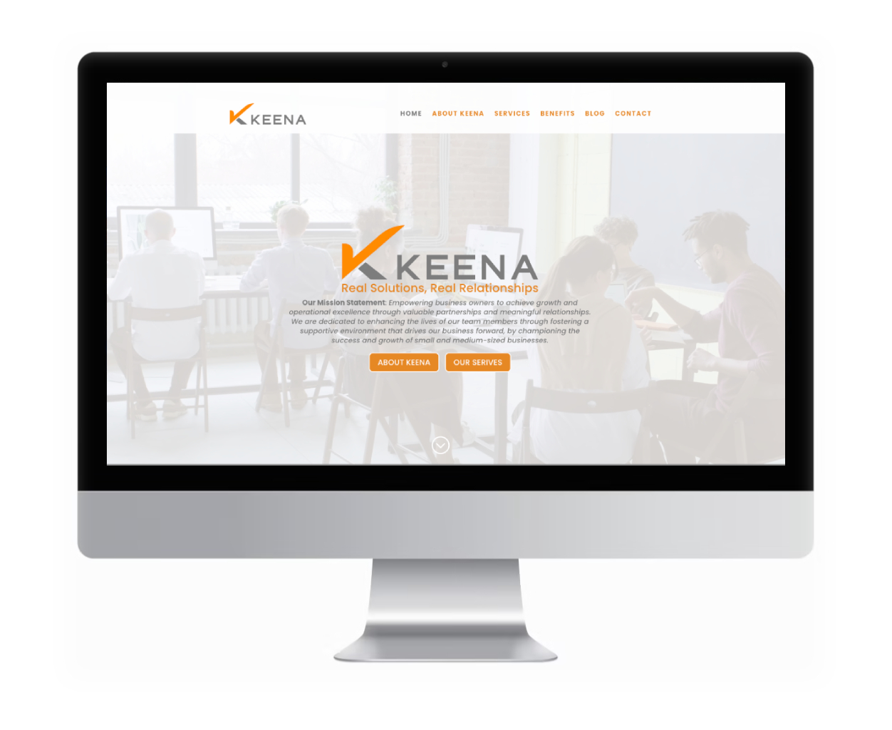
KEENA.com
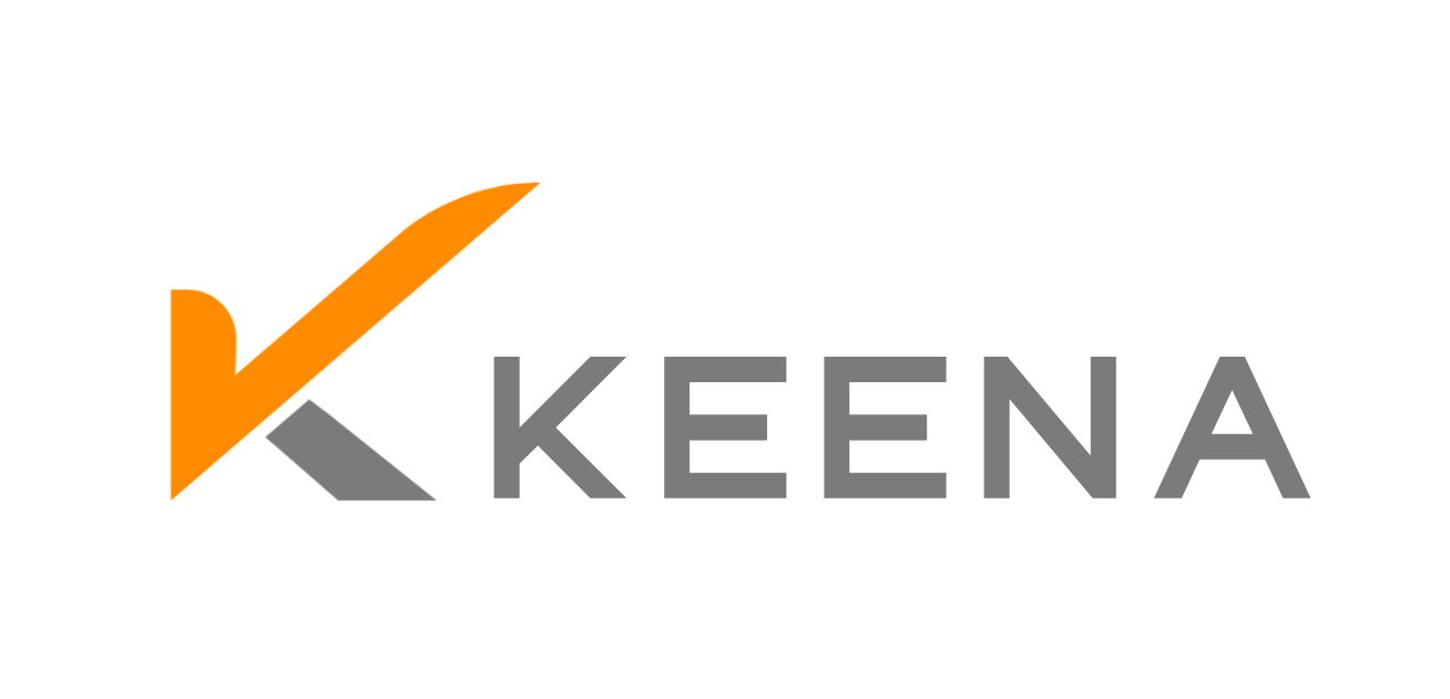
[ logo re-design ]
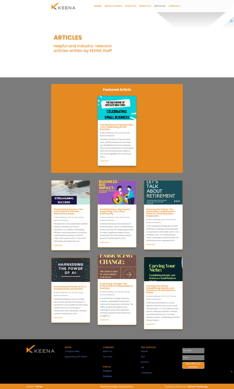
[ website re-design ]
[ content marketing ]
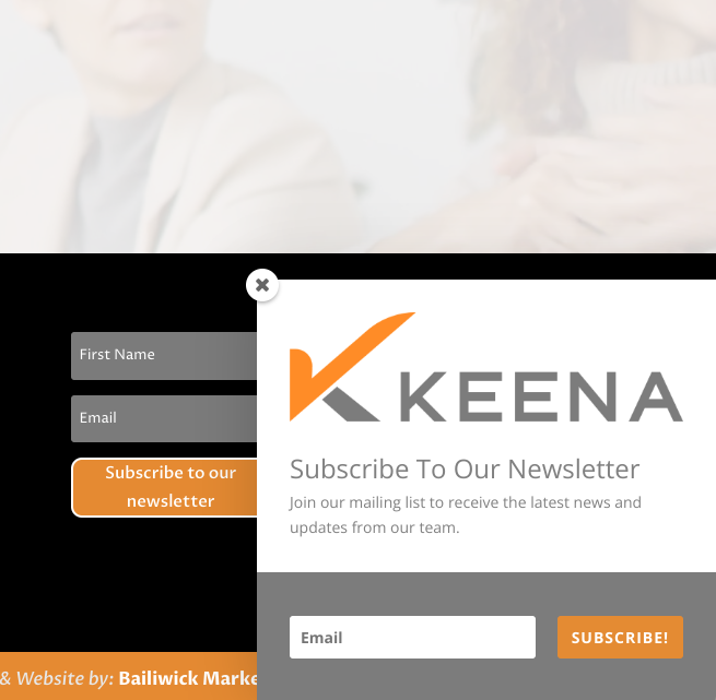
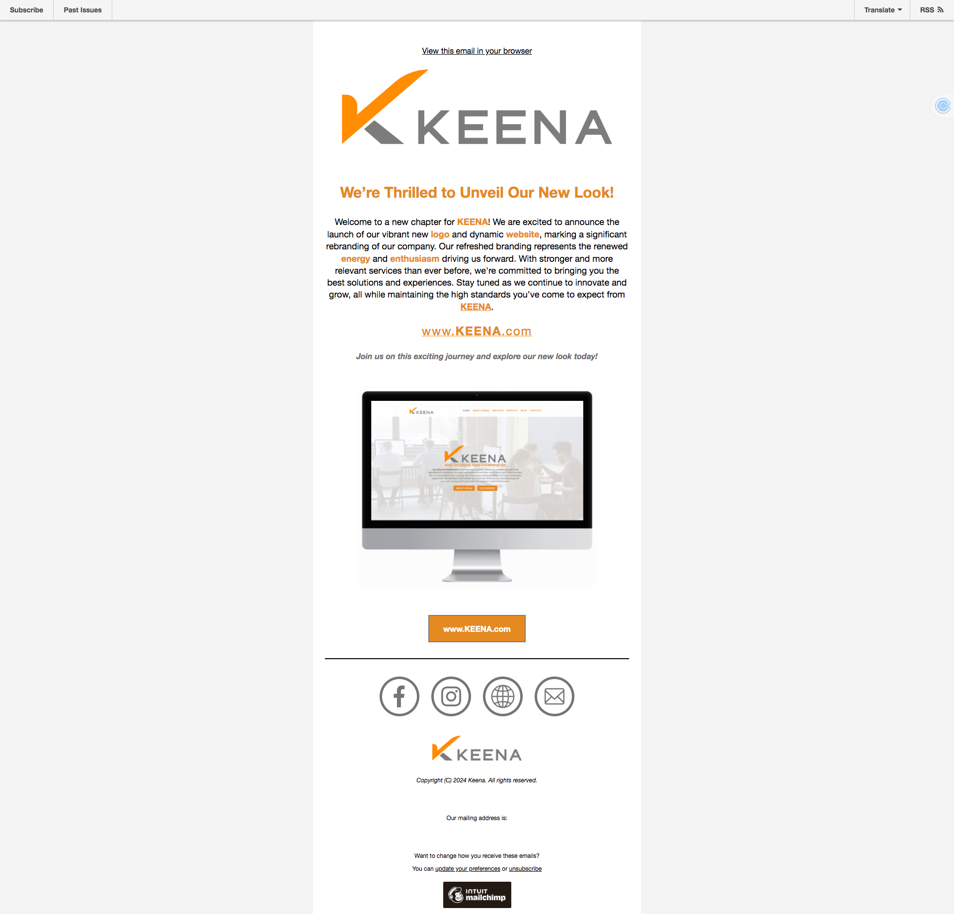
[ email marketing campaign ]
Kind Words from KEENA
“Working with Bailiwick Marketing has been an absolute game-changer for KEENA. From the very beginning, Bailiwick demonstrated an exceptional level of creativity, professionalism, and attention to detail. The rebranding process, including our stunning new logo, has truly transformed our brand identity. Our new website is not only visually appealing but also incredibly user-friendly and aligned with our mission. The content marketing strategy that Bailiwick implemented will significantly increased our online visibility, and the email campaigns will drive the kind of engagement we’ve always hoped for. We couldn’t be happier with the results and highly recommend Bailiwick Marketing to any business looking to elevate their brand. Thank you, Bailiwick, for taking our company to the next level!“
~ Sam Rathbun
General Manager
KEENA
~ Shawn Weinberger
Operations Manager
KEENA
The Challenge:
KEENA, a leading Professional Employer Organization (PEO), sought to revamp its brand identity, enhance its online presence, and better connect with its target audience. The project required a complete rebranding, including a new logo, a website redesign, an integrated content marketing strategy, and the implementation of an email marketing campaign. KEENA needed a partner who could deliver a cohesive digital experience that would resonate with both existing clients and new prospects. Bailiwick Marketing was chosen to lead this ambitious transformation.
Our Solution:
Bailiwick Marketing to the rescue!
Bailiwick Marketing undertook a comprehensive rebranding project for KEENA, covering every aspect of the brand’s digital identity—from logo design to content marketing and beyond. Our goal was to create a unified, engaging, and professional brand presence that would set KEENA apart in a competitive market.
Step 1: Logo Redesign
A crucial element of KEENA’s rebranding was the creation of a new logo that would represent the company’s identity and values.
• Initial Consultation: We began by discussing key aspects of the logo, such as colors, size, backgrounds, and its applications for both print and web. This ensured that the logo would be versatile and effective across all mediums.
• Concept Development: Based on our discussions, we created six distinct logo concepts that aligned with KEENA’s brand goals. Each concept was designed with the following criteria in mind:
• Relevance: The logo needed to accurately reflect KEENA’s industry and values.
• Aesthetics: It was important that the logo was visually appealing and professional.
• Scalability: The logo had to be effective at all sizes, from business cards to billboards.
• Market Perception: We considered how the logo would be perceived by KEENA’s target audience.
• Simplicity: The design was kept simple to ensure it was easily recognizable and memorable.
• Brand Differentiation: The logo was designed to stand out in the market, differentiating KEENA from its competitors.
• Versatility: The logo needed to be adaptable for various uses, including digital, print, and merchandise.
• Longevity: The design was created to remain relevant and effective for years to come.
• Client Selection and Refinement: KEENA selected their preferred concept, which we then reworked based on their feedback. Two rounds of design adjustments were included to fine-tune the logo to perfection.
Step 2: Strategic Website Design and Collaboration
Following the logo redesign, we moved on to revamping KEENA’s website, ensuring that it aligned with the new brand identity.
• Homepage: Bailiwick incorporated a video background for the homepage of the new KEENA website to create a modern and up-to-date first impression for visitors. The homepage design is simple, clean, and visually striking, introducing the new logo and brand identity while clearly communicating KEENA’s services.
• Services Page: We organized KEENA’s offerings into easily navigable sections, ensuring potential clients could quickly understand the full scope of services.
• About Page: This page was restructured to provide a deeper understanding of KEENA’s mission, values, and team, reinforcing the new brand identity.
• Testimonials and News Pages: Client testimonials and the newly branded Articles section (blog) added depth and social proof to the site.
• FAQ Page: An FAQ section was included to address common questions and provide additional context about KEENA’s services.
Step 3: Integrated Content Marketing Strategy
We developed a content marketing strategy that would not only drive traffic but also build KEENA’s brand authority and engage their audience.
• Article Creation: Ten client-supplied articles were reviewed, optimized, and aligned with the new brand identity. Each article was paired with relevant and intriguing images.
• SEO and Traffic: Articles were optimized with strategic keywords to enhance search engine visibility.
• Multi-Channel Distribution: Content will distributed across the website, newsletters, and social media, ensuring consistency with the new brand.
Step 4: Email Marketing Campaigns
To complement the website and content strategy, Bailiwick implemented a targeted email marketing campaign.
• MailChimp Setup: A new MailChimp account was established, and a versatile email template was designed, incorporating the new logo and brand elements.
• Personalization: Email templates were personalized for each recipient, enhancing the effectiveness of the campaigns.
• Testing and Scheduling: Emails were tested for accuracy and scheduled for optimal delivery times.
• Compliance: All email campaigns were compliant with regulations, including the required unsubscribe options.
Step 5: Testing and Launch
Extensive testing ensured that the website was fully functional, visually consistent, and aligned with the new brand identity across all devices.
The Results
The rebranding of KEENA, including the new logo, website redesign, content marketing, and email campaigns, resulted in a unified and professional brand presence. The new logo effectively captured KEENA’s identity, while the website and content strategies enhanced user engagement and search engine visibility. The email marketing campaign further extended KEENA’s reach, driving increased traffic and brand awareness.
Client Feedback
KEENA’s leadership was thrilled with the comprehensive rebranding, praising Bailiwick Marketing for our creativity, attention to detail, and ability to deliver a cohesive brand experience. The new logo, website, and marketing strategies have positioned KEENA for sustained growth and success in their industry.
Conclusion
This case study highlights Bailiwick Marketing’s expertise in delivering integrated digital solutions that drive business success. From logo design to website development and content marketing, our work with KEENA showcases our ability to elevate brands through strategic, creative, and technical excellence. We are proud to have been the driving force behind KEENA’s rebranding and look forward to future projects that challenge us to create impactful digital experiences.
KEENA.com
Kind Words from KEENA
“Working with Bailiwick Marketing has been an absolute game-changer for KEENA. From the very beginning, Bailiwick demonstrated an exceptional level of creativity, professionalism, and attention to detail. The rebranding process, including our stunning new logo, has truly transformed our brand identity. Our new website is not only visually appealing but also incredibly user-friendly and aligned with our mission. The content marketing strategy that Bailiwick implemented will significantly increased our online visibility, and the email campaigns will drive the kind of engagement we’ve always hoped for. We couldn’t be happier with the results and highly recommend Bailiwick Marketing to any business looking to elevate their brand. Thank you, Bailiwick, for taking our company to the next level!“
~ Sam Rathbun
General Manager
KEENA
MediateThroughIt.com
The Problem:
The client's website was like a digital time capsule—stuck in the past and desperate for a modern makeover. Not only did it scream "Y2K," but it also struggled with integrating their scheduling platform from an outside source.
Our Solution:
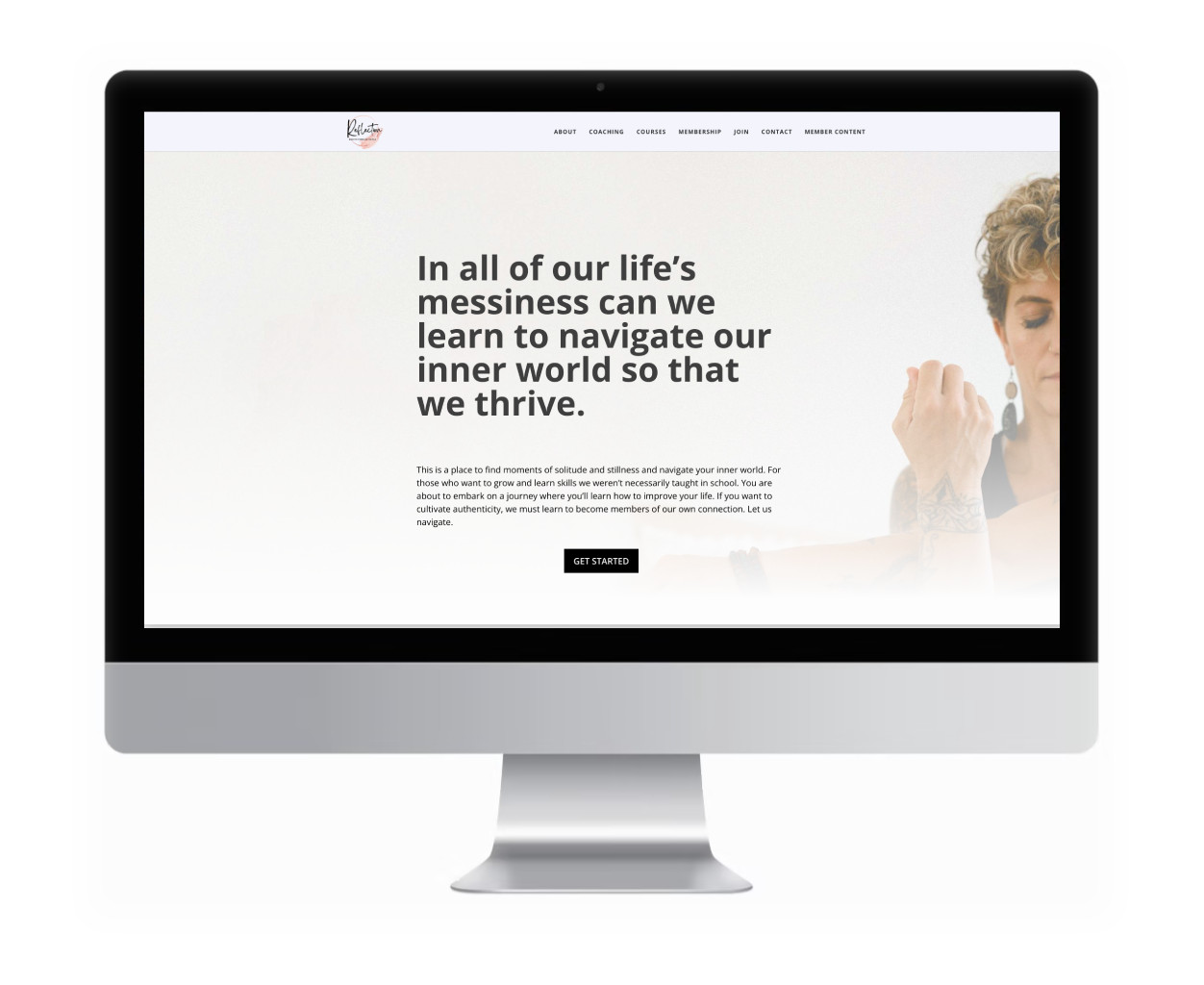
Bailiwick Marketing to the rescue! We dove deep into the client's values, goals, and branding needs, channeling our inner yogi to bring their vision to life. The result? A sleek, simplified website where clients could effortlessly view available yoga class times and register without breaking a sweat.
The fresh, modern design was like a breath of fresh air, making the old site look like a dusty relic. We also worked our SEO magic, boosting the yoga studio's search engine rankings so new clients could easily find their way to tranquility (and boost the studio's revenue).
And because we believe in keeping everyone in the loop, we added a mailing list subscribe form. Now, visitors can stay updated with regular studio news, events, and maybe even the occasional zen joke or two.
RodneyAllenBentley.com
The Problem:
A talented local artist with a fascinating background wanted a website to showcase not only his captivating art but also his intriguing story.
Our Solution:
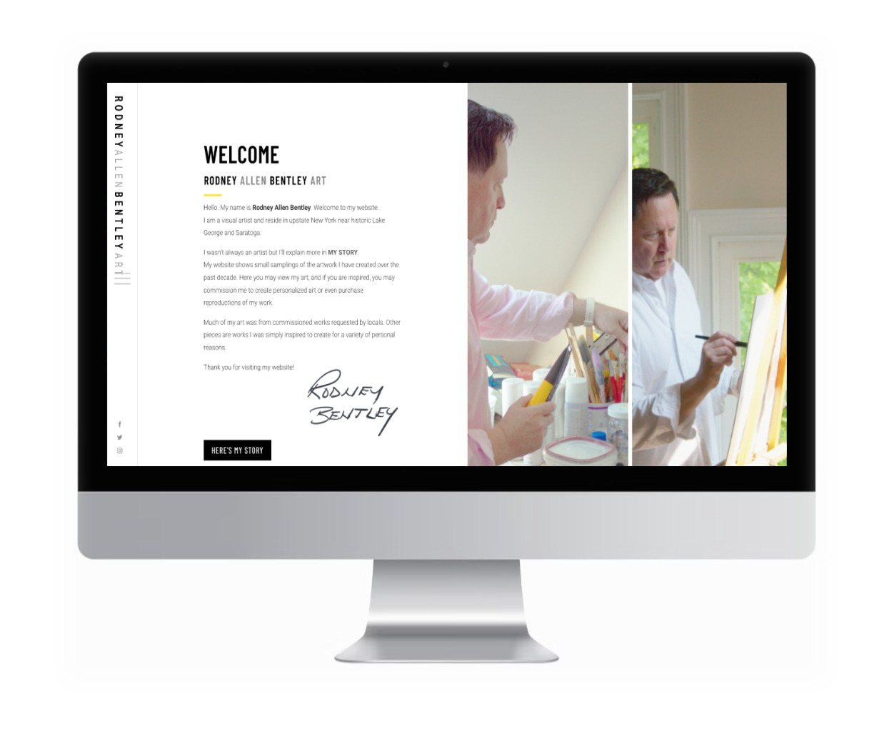
Enter Bailiwick Marketing! We met with the artist several times, immersing ourselves in his creative vision and keen eye for detail. His dream website had to reflect his work, location, and the art lovers most likely to appreciate his masterpieces.
After considering several design options, we crafted a simple and elegant site that perfectly complemented the artist’s work without overshadowing it. We digitally scanned several groups of his prints, transforming them into stunning images for his portfolio. And though the site serves primarily as a portfolio, it also features an eCommerce capability for future online purchases, allowing visitors to take home a piece of his creativity.
SEO was sprinkled in like fairy dust to boost the artist’s search engine rankings, making it easier for new admirers to discover his art.
We didn’t stop there! The website includes a mailing list subscribe form so visitors can stay updated on the latest news and events from the studio. Now, his art and story are just a click away, ready to inspire and enchant art enthusiasts far and wide.
MillerMFG.com
The Problem:
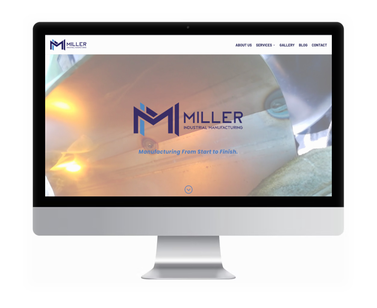
A successful and reputable engineering and manufacturing company in upstate New York had grown their business significantly over the years. However, their website was stuck in a digital time warp, crying out for a cleaner, more modern aesthetic. After we redesigned their main website with a fresh new look, it became clear that their second business website, which was far outdated, needed a drastic overhaul.
Our Solution:
Bailiwick Marketing sprang into action, first assessing the main website to determine whether an update or a complete redesign was needed. We opted for a streamlined, modern format that would make their digital presence as impressive as their engineering feats.
The new website features an intriguing video background on the homepage and a simplified, easy-to-navigate menu structure. To showcase their expertise, we included existing and new industry-relevant articles written by their top staff, transforming their site into a resource library of valuable information.
Not long after completing the main website, we turned our attention to their sister company, giving it a similar redesign for graphic consistency and a cohesive brand image across both sites.
SEO was implemented to boost search engine rankings, ensuring that potential clients could easily find their way to these engineering maestros. We also added a mailing list subscribe form, so visitors could stay updated with the latest news and insights from the company.
In the end, both websites not only looked fantastic but also functioned seamlessly, proving that engineering excellence and digital elegance can go hand in hand.
BailiwickMarketing.com
The Problem:
Our very own Bailiwick Marketing was in desperate need of a digital facelift. Our previous website was showing signs of old age—think of the proverbial barber who often has a disheveled appearance. It was time for a refresh.
Our Solution:
We approached our website redesign with the same thoughtfulness and care we give to our clients. We reviewed our identity and branding, choosing new colors that better represented our design firm—a mix of classic elements with a good-natured twist. Recognizing our internal bias, we enlisted the help of a logo graphics firm to create our new logo, speeding up the process and adding a fresh perspective.
Our new website is optimized to look awesome on smartphones and tablets, ensuring a seamless experience no matter the device. It features a simple portfolio to showcase our work and gives a bit of a “behind-the-scenes” look with case studies for select projects.
We sprinkled in some SEO magic to help us climb the search engine rankings, making it easier for potential clients to find us. And of course, we included a mailing list subscribe form, so visitors can stay updated with our latest news and insights.
To demonstrate our expertise, we included existing and new industry-relevant articles written by Bailiwick’s staff, offering valuable information to our readers. This content marketing approach continues with several new articles, creating a resource library of relevant information.
In the end, our new website not only looks fantastic but also functions seamlessly, proving that even the barber can have a great haircut.
ACRN-ny.com
The Problem:
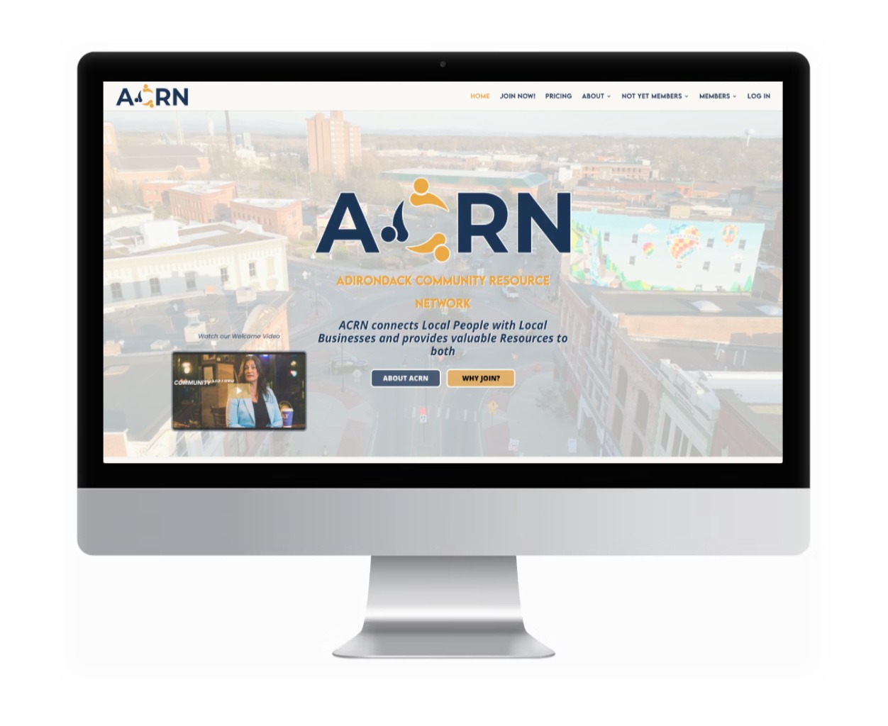
At Bailiwick Marketing, we’re all about connection and collaboration. We noticed a need in our local community and beyond for a platform that complements the many business networks in our area. We envisioned creating a space that offers a behind-the-scenes glimpse into the talented and dedicated people who power local businesses. Our goal was to make these businesses more personable by allowing owners, managers, and staff to create and share personal profiles, putting faces to names and stories to services.
Our Solution:
We approached our website redesign with the same thoughtfulness and care we give to our clients. We reviewed our identity and branding, choosing new colors that better represented our design firm—a mix of classic elements with a good-natured twist. Recognizing our internal bias, we enlisted the help of a logo graphics firm to create our new logo, speeding up the process and adding a fresh perspective.
Our new website is optimized to look awesome on smartphones and tablets, ensuring a seamless experience no matter the device. It features a simple portfolio to showcase our work and gives a bit of a “behind-the-scenes” look with case studies for select projects.
We sprinkled in some SEO magic to help us climb the search engine rankings, making it easier for potential clients to find us. And of course, we included a mailing list subscribe form, so visitors can stay updated with our latest news and insights.
To demonstrate our expertise, we included existing and new industry-relevant articles written by Bailiwick’s staff, offering valuable information to our readers. This content marketing approach continues with several new articles, creating a resource library of relevant information.
In the end, our new website not only looks fantastic but also functions seamlessly, proving that even the barber can have a great haircut.
Let's work together
Bailiwick offers a free, no-obligation consultation to help you determine if we're a good fit to help bring you more...
Success.
Profit.
Customers.
Sales.
Business.
